Wednesday, April 30, 2008

Daylily


Yesterday, I sold this piece, Daylily. It's 16 x 16, and framed, though not in this photo. I've had my work exhibited in a retirement community's gallery, and one of the residents, Mrs. H, bought it. When I went over there yesterday to take the work down, she was there checking her mail. She said "Are you Martha?!" and proceeded to tell me how lovely the piece is, and how happy she is to have bought it. Mrs. H and her daughter were looking at the work, and when they saw it, they both started to cry.


It turns out that Mrs. H's best friend, now deceased, was also the daughter's godmother, and grew daylilies the same shade as the fabric in the piece. When she died, Mrs. H and her daughter took some of her bulbs and planted them in their gardens to remind them of their friend.


Today, the daughter is bringing her husband home from the hospital to die. He's 48, and has been struggling with a brain tumor for 5 years, and there's nothing left to do for him. Mrs. H will hang it so that it's the first thing they see every morning. I am so honored.


I made Daylily in 2003, using commercial and artist-dyed fabrics, embellished with machine embroidery, oil pastels, and beads. It has been exhibited locally and in Cergy/Pontoise, France.

Thursday, March 27, 2008

Spring has arrived!

Well, even though we were wearing coats, it seemed like spring to us. My sister and I took our cousin from South Dakota sightseeing in Virginia this week. Monday was Monticello and the University of Virginia. Here we are in front of the Rotunda. I wonder how many photos like this have been taken!


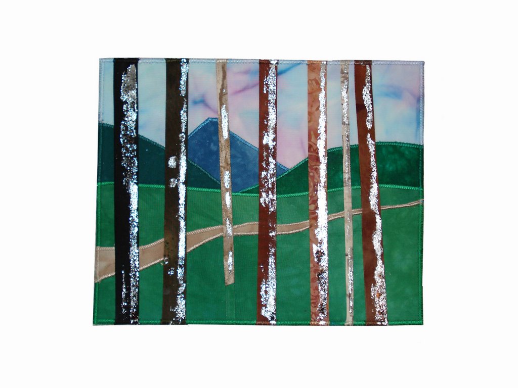
This next photo is of a piece I finished recently, and hung in an exhibit at the Columbia Art Center. I wanted to go back to the tree idea I was working on last spring. It too has a lot of paint on the surface. I used Shiva Paint Sticks among other paints, and I like the effect they give. It's called Blue Marsh, and it's 23 x 17.
And it sold, too!

Thursday, March 06, 2008

Art Consulting

I met with an art consultant this morning. She has owned a successful gallery for 35 years. The goal of this morning's meeting was to get started thinking about what I want to do, what my goals are, and how to achieve them. She is very enthusiastic about my work, although it doesn't fit in her gallery.

So I came home all jazzed up and ready to work. I painted 10 pieces of fabric when I got back, but they are still curing so I can't show photos of them. Instead, here is a piece I did recently:


I collaged fabric and painted it with Lumiere, Setacolor, and Shiva sticks. Then I cut it up and collaged it again, and painted it one more time. I used the grids because I wanted to create a sense of looking through a window.

Sunday, July 01, 2007


I'm not sure if this is wretched excess or not, but it's cool. My husband got this at a business meeting the other day. You might think it's just a travel mug, but you'd be wrong.


It's a travel mug that plugs into the cigarette lighter power source in the car! So your coffee will stay warm while you drive! This is the best freebie he's brought home for a long time. Usually it's umbrellas or gimme hats.


I've been working on things I started at QSDS. I did as many of the exercises as I could as 8 x 10's so that they can be weeklies. So I have the first year of weeklies finished, and I'll photograph them soon and publish a few.

Friday, June 29, 2007

QSDS was great, as usual. The class I took was Sue Benner's Driven to Abstraction. I'm awfully literal, so it was a great exercise in letting go. On Tuesday, we were to have 5 small studies completed by 11 AM. Well, at 11 I had one. Exactly one. I really struggled, but once I quit being so literal, I got them all done quickly.


Another exercise was to make a piece in an odd shape. I like it a lot, but I haven't finished it. Here 'tis.

Thursday, June 14, 2007

Polka Dots

I'm supposed to be packing for QSDS, but instead I thought I'd show you what my sister, Nancy, has been up to. I have been painting fabric and generally messing around in the wet studio, so not a lot to show for myself. But not my sister! She's nothing if not productive. This is the front of an old dresser she got from a friend. It was very brown and tired looking when she got it, and she couldn't wait to sparkle it up.


Here it is with the bookshelf on top. It sits in the corner of her (blue and white) kitchen.


Here are the detail shots. First, a side view:


This is the other side.


Here it is with the bookshelf on top.

This is what the top looks like.


Now you can see why my friends all say that "Nancy" is a verb!

My only contribution was to suggest more polka dots when she said it needed something else. Polka dots: my solution to every design problem. Well, almost every design problem.

I suppose I should get moving. All my stuff is packed, I just have to get it in the car. Cathy and I are leaving this afternoon. Tomorrow we will see the Fiberart International Exhibit, and then head for Columbus.

Monday, June 04, 2007

Weekend art classes

Over the weekend, I went to the ArtExpo! event in DC. I took a class called Tantalizing Textures, in which the instructor used various mediums to make texture on a background for a collage. I learned a lot about mediums. There is one called tar paste, which holds its shape when drizzled onto a surface. It can be tinted with acrylic paint, too, which is really cool. I think it would also be good for making stamps. Abstract stamps, that is. It would be difficult to drizzle it into an image of anything. She also used molding paste and extra heavy gel mediums. They also have potential for making stamps.


The other class I took was pastel drawing. I'm really interested in pastels, so this was lots of fun. My end result is nothing to write home about (or blog about, either!) but I learned a lot. I also spent a lot.


The merchant mall was jammed with vendors selling all sorts of art supplies, at a discount, no less. I bought a few sketch books and some pencils, a starter kit of mediums from Golden and stuff like that. There were paint companies, brush and paper reps, you name it, if it had to do with painting or drawing, it was there. Nothing related to fiber, though.


During a break I went wandering around to see what other classes were doing, and happened upon a class in watercolor collage. They were painting paper with watercolors to use as elements in realistic collage. The examples were very realistic, and lovely. So today I painted paper with watercolors, just to see. Also fun. Here is a photo of a piece of paper towel I painted.


I really like the texture. Almost too cool to tear up for collage, but. . .

Thursday, May 31, 2007

Notan

The new Quilting Arts Magazine came the other day. Jane Dunnewold has an interesting article in it about the positive/negative exercises called Notan. So I decided to try it, and this is what I came up with:

For the above, I cut a blossom shape out of the dark paper, and reversed it for the positive/negative effect. Very lacy, and the black and white squares are very quilt like.

Next I tried a more involved design, of a Christmas ball. Unfortunately, after a considerable amount of work, it looks like baseballs to me. I like the pinwheel effect caused by the roundness of the image.
Read the article and try it. It really is fun and it's way different from the way I usually work. I remember that Jane taught a weekend workshop in Notan a while back at QSDS. Now I wish I had taken it.

Tuesday, May 29, 2007

Image transfer

Yesterday, well actually Sunday and Monday since it's a long process, I tried image transfer with gel medium. I had an old letter copied (it has to be a toner based copy) and coated the paper with four coats of gel medium. After the last coat, it had to dry for 8 hours. Then I soaked the paper in water and rubbed the paper away, leaving a rubbery copy of the letter. It was a lot of rubbing, since it was an 8.5 x 11 sheet of paper. I like the results, and I need to practice applying the gel medium so that the brush strokes don't show. I plan to use it in a collage, but I don't quite know how yet.

Here is the most recent weekly:
I need to work on shadows. These make the trees seem more grounded, but I don't think that that is how shadows really work. I should go draw some trees, I suppose, so that I know what they actually do. It's a very pretty day, not too hot yet, and that would be a great way to spend the afternoon.

Monday, May 28, 2007

Another Memorial Day

It's Memorial Day again. Since this is an art blog, I'll stay away from the current war, and instead here are photos of the American Cemetary in Normandy, where 10,000 American service men are buried. They died in the Normandy campaign, not just on D-Day. It's a very sobering place.


I took these pictures in the spring of 2005, on a trip to France with other artists.

Wednesday, May 02, 2007

Painting Fabric


This is a piece of fabric I painted over the weekend. It's about 18" square. I used black and burnt sienna Setacolor transparent paints, and scrunched it up to dry.

I've been having such a good time painting fabric that I called Testfabrics to order pfd. In the fall, I toured their facility with Cathy Kleeman. It is very interesting. At one point, there was a big pile of narrow bolds heaped in a corner. Seems taht they have a client who wants narrower bolts than Testfabrics usually carries, so they cut the ends off. Those cut ends are great for painting, so I ordered one. It's 18" by 135 meters. I won't need to buy any pfd for a while! But I'd better invest in more paint.

Tuesday, May 01, 2007

Weeklies Update

Here is weekly #39.

As you can see, the background is the same woven technique that #38 used. This weaving did not have enough contrast, so I screen printed the trees on it. I wanted to make the tree on the left come forward, and the one on the right recede. More or less successful.

But while I was getting ready to photograph it, I looked up at the rest of them. I have them hanging on the wall of my studio, just below the ceiling, in chronological order. I started this series in July, and the first 8 are relatively bright, not cheerful really, but light and airy I guess. (Except the fish.) September's output was less so, and they get darker and darker until April, when they begin to lighten up again. I've always hated winter, and I dread fall, because I know what's coming. It's interesting to me how this has played out in the choices I made when making these.

Here are photos of them in my studio. The light is bad, but you can see how I have them displayed.

Monday, April 30, 2007

Monday doings

I've been painting fabric. Several friends came over a week ago, and we spent the day in the yard being messy. The fabric I painted turned out well, and I'm pleased to report that I've gotten the hang of using a curved-tipped syringe for painting. I was getting blobs of paint, but then I began to put the tip of the syringe directly on the fabric, and use it almost like a pencil. Much better! I took a bunch of photos, but I mislaid my camera so I can't post them. Next time.

Meanwhile, I'm behind on my weekly series, and this is the most recent one:

The blue and green landscape was painted with Setacolor on dry fabric, and the in-between fabric was done with Caran d'Arch (I think that's how it's spelled) water soluble wax pastels, and liquitex gold. I used the syringe for the gold.


Anyway, the idea was to suggest a field of flowers, but I think that I should keep the flowers in the lower part, and weave clouds or something like that in the sky. I also think that the horizon line is too centered. But I'm my own worst critic.

And speaking of which, I saw a play Saturday night, Things of Dry Hours, by Naomi Wallace. The main character said at one point that he worked hard, so that he could silence the voice in his head telling him his work was futile. I could relate: my inner critic is loud and opinionated!

Wednesday, March 21, 2007

Pissarro Exhibit, Baltimore Museum of Art

I went to the BMA today, with my friend Ruth, to see the Pissarro exhibit. It focused on his landscapes throughout his career. It's an exhibit that's really worth seeing. Impressionism is not my favorite artistic period/style, but the impact these people had on the course of modern art is unarguable.

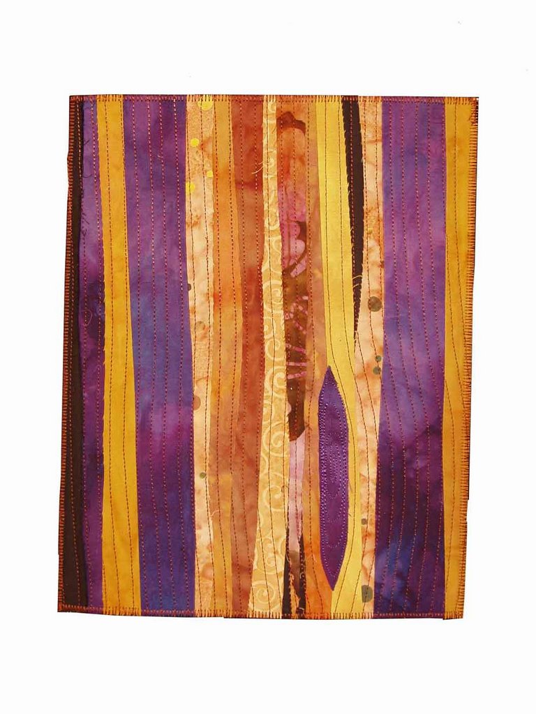
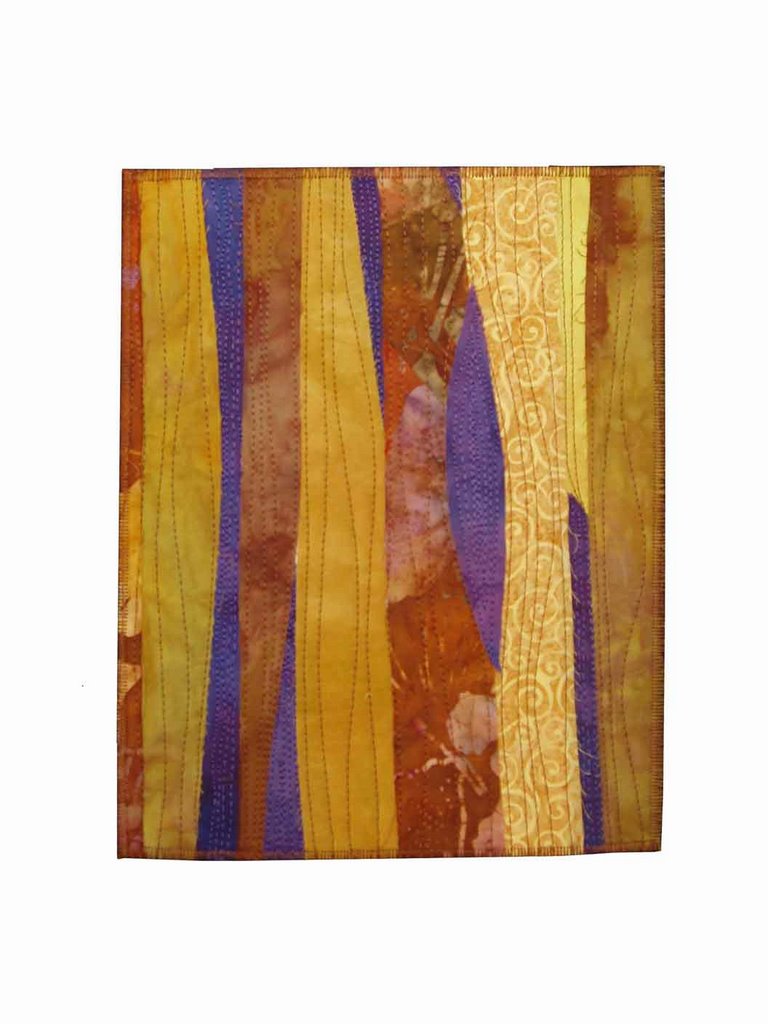
Ruth had asked me to make a postcard for her to hang near her desk at home. She had specific colors she wanted me to use. They were lime green, dark green, purple and yellow. Not the dark and somber pallette of browns and deep purple that I've used recently. It was fun to use such bright colors again. Maybe it's a mistake to veer away from a pallette that I so obviously enjoy. Anyway, here's what I took for her to choose from:

She bought this one:
and this one
But not this
or this (well, this one doesn't really have the color scheme, so it hardly counts.)

I have to say I agree with her choices. She had a hard time choosing between the first two, so I said "Flip a coin, and see how you feel about the outcome." I do that a lot, and if I'm sad at the result of the coin toss, well, I choose the other one. It's another piece of information to help in decision making. So she did, and was happy at the outcome, but decided to buy both anyway. A good outcome for both of us!

Monday, March 19, 2007

Show Photos

I mentioned the other day that I, and two others, have work on display in the lobby gallery of RTKL, a Baltimore architectural firm. Here are photos of the show. The lighting in the lobby is really odd, so you'll have to forgive me.

These are by Adrien Dawson.


This is Cathy Kleeman's work.


And these are mine.

Weekend travails

We drove to Virginia yesterday to my brother's to watch Virginia play Tennessee in the basketball tournament. There was no joy in Mudville, as Virginia lost a close game. Oh, well, it was great to be there, and it was a really lovely day for a drive.

Here is today's photo: my brother's dog, Bama, looking for a scratch behind the ears.


And to make this art related, here is a small piece (12 x 12) that I've been fiddling with.


I like the bright spring colors. It's far from finished; I'll add some stitching of some sort in places, and trim the edges. Finishing it is today's goal (I don't want to aim too high!) and then I'll finish cleaning the studio.

Wednesday, March 14, 2007

TV Update

Lately, my life has seemed way to boring to inflict it on the blogging public. But here I am, back again. However, an update on the tv problem: after a period during which it did not turn itself on at 8PM, it has begun again. Maybe I need an exorcist.

I have some work exhibited in the lobby gallery of RTKL Associates, a Baltimore architectural firm. The other artists exhibiting now are Cathy Kleeman and Adrien Dawson. We are members of a local fiber group, Fiber Artists of Baltimore. RTKL's Art in the Workplace committee found the group on the web and asked us to submit slides, and Cathy, Adrien and I were chosen to exhibit. We each have one wall in the lobby, and we share a wall in one of the conference rooms. Since I have a series of small (8 x 10) pieces, I was able to show them in another conference room.

I have photos, but the new google-blogger won't let me upload. Great first impression of the new blogger.

Monday, February 05, 2007

OK, I give.

Will whichever nephew who thought at Christmas it would be a great joke to program our tv to come on every night at 8, please call and tell me how to undo it?

Here are two of the latest weekly pieces. Number 29 uses foil on the trees, which are pieced into the background.


For Number 32 I used only foil for the trees. I think #29 is more successful, partly because it has more interest in the background.


I'm now working on number 34, which puts me a couple of weeks ahead. That's a change!

Thursday, January 25, 2007

More Weeklies

Another of my 2007 goals is to learn to take better photographs of my work. The weekly exercises (each is 8 x 10) are a good subject since (ideally) there's a new one each week, and they aren't meant to be sold so the photography is less crucial. Here are two consecutive ones that I photographed this week.


This is number 17. I don't date them other than the year, so I can only estimate that they were done in December when I was working on the larger pieces in this color scheme, which are on display at the Slayton House Gallery.


Naturally, this is number 18. I am pleased with both of them, although I like the richer tones of #17. I like working large and small at the same time. Some of the challenges are similar, but there are significant differences in making something work in a piece that's 26 x 40 and in a piece that's 8 x 10.

I'm a couple of weeks behind, as usual, and this week I've moved into a different direction on the weeklies. But I like these enough to go back to this style. I guess I'm still interested in trees, and these alternately look to me like trees in a forest and bark.

It's getting late in the morning, so I need to get to the studio. I have another show looming, and I want new pieces for it.

Monday, January 22, 2007

As long as there are postmen, life will have zest.

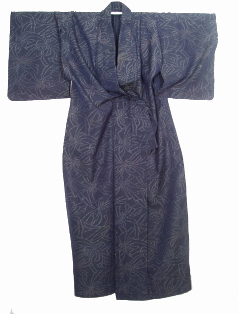
In today's mail, I received a gift from a friend in Hawaii. She was cleaning out her mother's things, and thought I'd like to have this kimono. I am truly touched by her generosity.

I'm sure I have it hanging wrong, but I wanted to get it posted right away, so I took the photos without doing any research about how the front pieces should be crossed. Here's a detail.

It's a lovely blue background, with the design in a creamy blue, shot with red. As far as I can tell, it's all hand sewn, too. It really is beautiful, and my friend Marie Milks is generous beyond description to send it to me. She said that she hoped I could use it in my work, but I don't think I could ever put scissors to it.

Thank you, Marie, from the bottom of my heart.

And thanks to William James, the author of the above quote.